Overview
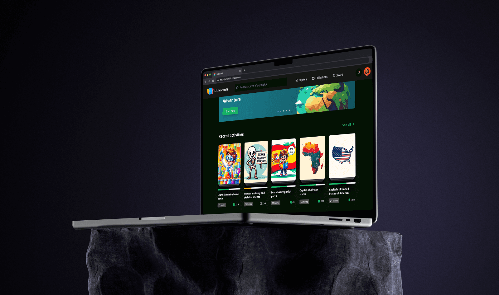
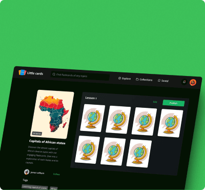
Little Cards is an innovative, mobile-first flashcard application designed to revolutionize language learning and memorization. Little Cards reimagines the flashcard experience, offering a fun, interactive, and visually appealing platform. The app caters to all language learners and anyone seeking to memorize information, with a particular focus on younger users.
Challenge
Little Cards presented unique UX design challenges:
Balancing fun, gamified elements with serious educational content
Designing for spaced repetition learning while maintaining user engagement
Creating an interface that supports various card types (text, image, audio) seamlessly
Developing a system for user-generated content that maintains quality and relevance
Designing for both individual learning and social sharing of card decks
Solution
We tackled these challenges with creative UX approaches, which are:
Adaptive Difficulty Scaling: We designed an intelligent system that adjusts card difficulty based on user performance, keeping learners in their optimal challenge zone.
Micro-Learning Moments: We created brief, engaging study sessions designed to fit into small pockets of free time, perfect for our young, busy target audience.
Multi-Modal Card Creator: We developed an intuitive card creation interface that seamlessly integrates text, images, and audio, encouraging diverse learning materials.
Community Curation System: We designed a user-driven rating and tagging system for shared decks, ensuring high-quality, relevant content rises to the top.
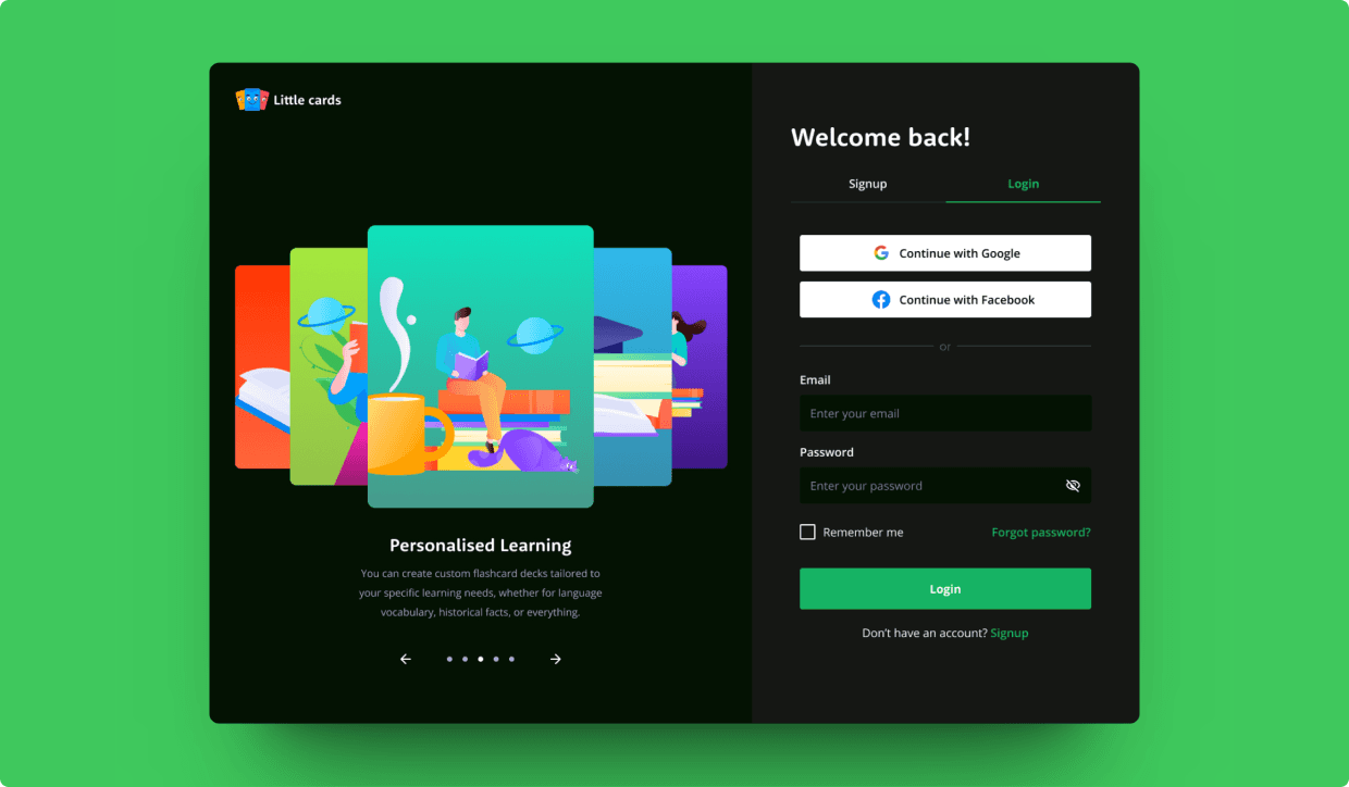
Social Learning Paths: We introduced "Learning Journeys," where users can follow curated sequences of decks created by peers or experts in various fields.




Process overview
For Little Cards, we employed a distinctive approach:
We conducted "learning style workshops" with target users to understand diverse memorization techniques
We created rapid prototypes of different game-like elements and tested their effectiveness in information retention
We employed eye-tracking studies to optimize card layouts for quick information processing
We developed a custom design system that allows for playful elements while maintaining clarity and readability


Results and impact
The UX design for Little Cards has redefined learning experiences. Users report significantly higher engagement compared to traditional flashcard apps, with many citing the adaptive difficulty and social features as key differentiators. Our design has successfully created a platform that turns memorization from a chore into an engaging, social activity, particularly resonating with our young adult target audience.


